1min 31s Novice Chinese Greek Spanish
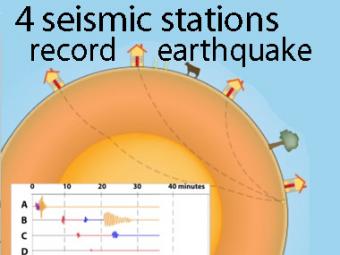
Same earthquake, different stations; why do the seismograms look different?
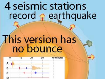
We use a cow and a tree in this narrated cartoon for fun and to emphasize that seismic waves traveling away from an earthquake occur everywhere, not just at seismic stations. A person would feel a large earthquake only at station A near the epicenter. Stations B, C, D, and the cow are too far from the earthquake to feel the seismic waves. Both the scale of the buildings (and cow) and the amplitude of the movements are exaggerated. The cartoonish amplified ground motions show the compressive (up-down in this case) P wave, the shearing (back-forth) S wave, and the rolling surface wave motions recorded by sensitive instruments. Notice that Station D does not record an S wave because shear waves cannot travel through Earth's liquid outer core. One seismic station can give information about how far away the earthquake occurred, but yields little other information. The cartoonish amplified ground motions show the compressive P wave, the shearing S wave, and the rolling surface wave motions recorded by many stations with their characteristic seismograms. See also Travel-time curves.
CLOSED CAPTIONING: A .srt file is included with the downloiad. Use appropriate media player to utilize captioning.
ANIMATED GIFS (MP4 FORMAT): short segment of entire animation available as Optional Download.
This companion to the animation "Four-Station Seismograph network" shows the arrival of seismic waves through select wave paths through the Earth (P and S waves) and over the surface of the Earth. The movement at distant stations occurs at a microscopic scale. While that doesn't result in noticeable movements of the buildings, the arrivals are recorded on sensitive seismometers.
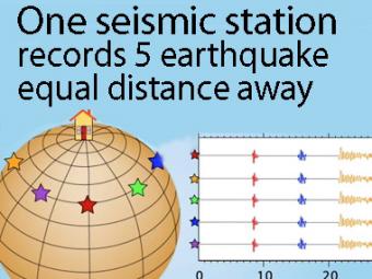
A gridded sphere is used to show a single station recording five equidistant earthquakes.
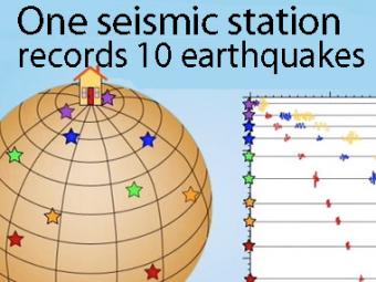
A gridded sphere is used to show:
1) the seismic stations don't need to be lined up longitudinally to create travel-time curves,
as they appear in the first animation, and
2) a single station records widely separated earthquakes that plot on the travel-time curves.
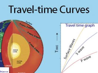
A travel time curve is a graph of the time that it takes for seismic waves to travel from the epicenter of an earthquake to the hundreds of seismograph stations around the world. The arrival times of P, S, and surface waves are shown to be predictable. This animates an IRIS poster linked with the animation.
Students work first in small groups, and then as a whole class to compare predicted seismic wave travel times, generated by students from a scaled Earth model, to observed seismic data from a recent earthquakes. This activity uses models, real data and emphasizes the process of science.
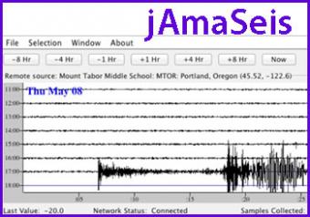
jAmaSeis is a free, java-based program that allows users to obtain and display seismic data in real-time from either a local instrument or from remote stations.
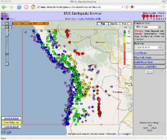
The IRIS Earthquake Browser (IEB) is an interactive tool for exploring millions of seismic event epicenters (normally earthquakes) on a map of the world. Selections of up to 5000 events can also be viewed in 3D and freely rotated with the 3D Viewer companion tool.
We encourage the reuse and dissemination of the material on this site as long as attribution is retained. To this end the material on this site, unless otherwise noted, is offered under Creative Commons Attribution (CC BY 4.0) license